Friday, 22 January 2016
Thursday, 21 January 2016
Q4 - Evaluation
What have you learned from your audience feedback?
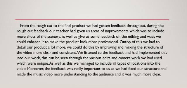
Feedback from the teacher
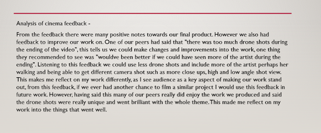
Cinema Feedback:
Ancillary Feedback:
Q3 Evaluation
Ive used many types of different technologies to create my work, I will now include some screenshots in me editing with Weebly, a media technology used to help contruct, plan and research for my fan base page. From the screenshots on the left hand side, you can see that there is a list of elemets I could use into the website. For example, I was able to add buttons into the website to link me to different parts of the website. Also, weebly let me embed my final product from youtube into the fan page, this helped the work standout and keep consistency.
Weebly was really effective for me as it was easy to use but produced a really powerful website for the artist and audience to view.
Q2 Evaluation
My Emaze presentation for the evaluation, question 2
Also ive supplied the link
http://www.emaze.com/@AFCRFZWW/presentation-name
Also ive supplied the link
http://www.emaze.com/@AFCRFZWW/presentation-name

Wednesday, 20 January 2016
Q1 Evaluation
Audio analysis of Q1 of evaluation
My final digipak product which follows the conventions.
The final website
Question 1 Evaluation
Addition to inspiration - We wanted to use the drone shots to give the similar effect of our artist being the only person in a nice big location, however, we could not use those shots as other people ended up being in the video.
Tuesday, 19 January 2016
Evaluation-Question 4-
Evaluation Question 4
Below is my presentation for question 4 on the evaluation
Below is my presentation for question 4 on the evaluation
Monday, 18 January 2016
Friday, 15 January 2016
Final product - Digipak
So, I asked for feedback about the second version that I changed my digipak into. I was told that the previous design with St Pauls on the left hand side would look better instead of a candle. I was told the candle would be more ideal for the inside of the digipak.
So I implemented my feedback into my work and added the St Pauls background back. I felt like the image still looked a little bit too happy. I then began playing with the colour balances and curves to make the image less saturated but still have a blue undertone to it to add on to the rainy theme.
This is my final product. I believe the artists head is a little bit too low in frame in the outer panel, but I wanted the hat, which is our synergy, to be fully in the photo.
Mock sample of my digipak
I am currently in the process of creating my Digipak. My initial ideas is to stick with the black and white theme to fit the convention of a soul artist but my group has decided to use colour for all their digipaks. So to improve my digipak so far i need to add colour and defiantly the title of the album. The playlist of the album needs to also be featured in the digipak as this a normal convention. The picture I choose needs to make sense and flow well. If it does not it will make my digipak look much less professional. Also I need to add the artists name, record label and barcode to the spine of the outer layer of album to make it look more like an album. Lastly i need to speed myself up and create the inner part of my digipak!
Possible image to be used instead:
Evaluation-Question 1-
Question One-Evaluation
Below is the video for my answer to the first question of the evaluation task:
Mock sample of my website
The initial ideas for the homepage of my website is black and white theme as it corresponds to the genre of my artist which is soul. The black and white shows emotion, something that may appeal to my target audience.Also it sets it apart from other mainstream artists and makes the website more memorable. This will make more people want to visit the website as it original.
Areas of improvement:
I still need to add my digipak to my website so fans can view it, and also possibly purchase it.Also it will make the website look more legit as other artist have links or picture to purchase their latest album on their website. This immediately draws fans to consider purchasing the album. Here is and example of a similar artist as mine website using the homepage as a way to advertise her album:
Final Ancillary Website
This is how my official homepage of my artist looks like. After many alterations i finally decided how i wanted it look. It fits the my artist as is simplistic and professional looking. I grew inspirational from other artists within the same genre as mine websites i.e Adele and Lana Del Rey.
Final Ancillary Digipak
Here is my final draft of my Digipak.
This is the outer cover:
This is the outer cover:
This is the inner cover where the actual CD would be placed:
Anciliary work: Website
Ancilliary work: Website
Here is the link for my website for "Aurora"
http://auroraofficialwebsitepage.weebly.com/
Here are some screenshots of my website
Thursday, 14 January 2016
Third draft digipak
Today i decided to let go on the first digipak design as it looked too dark and the background looked too artificial in comparison to the artist. I thought it looked like basic leveled work.


I changed the pictures into rain and a candle which connotes the album title Set Fire To The Rain. I though in this design the artist looks more brighter and the background looks less artificial.
Wednesday, 13 January 2016
Second draft of digipak
Today I added a slight blue tint on to the digipak for some colour. I also began playing about with the fonts and the position of the artist on the digipak, I opted for a simple yet effective font that reflects the artist and the genre.
Tuesday, 12 January 2016
Monday, 11 January 2016
Editing Session - Ancillary Production (Mock Products/First Draft)
My digipak -
This editing session involved me starting the digipak. I had explain changes to my plan, and had explained it would be a better alternative to change my product to suit the audience and artist a lot more. The colour brings attention towards the audience as well as it showing us the power of the artist.
I have not yet finished as I would like to include a quote on the back of the digipak as well as go add a few twitches to make it look more professional..
First draft of Digipak
This is my first draft for my digipak. It is black and white with simplistic fonts and a rainy theme.
I created my own barcode aswell.
Sunday, 10 January 2016
Subscribe to:
Comments (Atom)


